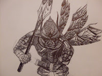
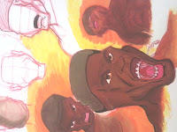
I have recently decided to alter my character in terms of his background story. The main character is now a militant artist, relieved from duty and is now a practicing artist. In the background, I will include war memorabilia, including purple heart badges, a tattered war flag, etc. I have decided to rename my piece from "Block" to "The Art of War," inspired by a book I've recently picked up and read by Sun Tzu. I believe this will help me develop sophistication with a character in a short amount of time. My thesis not only relates to how nihilistic we are and how self-accepting we need to be, but in terms of this character, how it may imply a metaphor (purple heart badges in the background) that he is mentally insane, trying to fight his inner demons. Also, the notion that my clip is very short implies that the "art of war" is very immediate, instinctual, and climactic.
P.S - I may make a parody of Sun Tzu's book and include that piece of artwork somewhere in my animation!
Practicum Blog
Tuesday, November 20, 2012
Tuesday, September 25, 2012
Wednesday, September 19, 2012
THESIS UPDATE:
Thesis: Man tends to destroy his creation if it’s not
perfect in his eyes…Instead of erasing those mistakes, let those mistakes be
visible so that you may learn from it…
Basis of the Story: Man draws
something he don’t like, tries to erase it, picture comes to life (in his
world) in self defense, and they have a short battle until the artist
eventually and inevitably wins.
Questions to Ask:
What sorts of mediums (other than the computer) would be
more effective in conveying or enhancing my message?
Do you think the very act of cleaning up your sketches
before finishing your animation is direct contrast to your thesis?
How do you think you should interpret the ending?
Who is your audience? Specifically other artists, or people
who create in general?
Why do people create and why do people destroy? Is it the
mystery of exploring the unknown? Or is it an uncontrollable impulse born
within man?
What does it mean if the artist wins?
The battle is metaphorical– as
he erases a part of his monster he created, he is slowly destroying the
potential of his creation, condemning it to non-existence. The battle metaphor
was derived from a film I’ve watched, here is a link:
Aside from my questions log, I
have found three animators, each with a specific/ unique technique. The last
one at the bottom greatly influenced me to tackle the aspect of creation and
nihilism from an artist’s perspective (not necessarily what the Backwater
Gospel conveys, but nonetheless it’s awesome!) Harry Partidge has a whimsical aspect to cartooning that I like, and Hisko is working on an animation called Junkyard. I find it interesting that he included actual oil paintings in for his background, meaning he painted over 100+ pictures on canvases. He also combined 3D objects (created from Maya) to juxtapose perfectly with his Oil paintings. The result is pretty fasicinating! Here's a link to it:
Harry Partridge
Hisko Hulsing
The Backwater Gospel
Director- Bo Mathorne
Arthur Gil Larsen
Tuesday, September 18, 2012
Animation/ Sketches/ Ideas/ Thesis Update:
I have made more progress in my non-capstone oriented 2D animation called, "Eagle, Human, Mouse". I am currently at 28 expected scenes with 24 scenes finished in Flash. Below are some snapshots of (frame-by-frame) new animation works:
AFTER EFFECTS:
After I complete a scene, I throw the raw SWF file into After Effects for some finishing touches (in terms of visuals) This is what it looks like Pre-After Effects & Post-After Effects:
Here are some more finished visuals using After Effects:
I have also been gathering a few sound effects, more so thanks to a sound art class I am taking up. Right now, I am using a condenser microphone with phantom power, in order to get specific crisp clean sound effects (moreover for voiceovers). Even though I might decide not to have a voiceover in this specific project, I am considering utilizing human murmurs, scowls, gasps, and other trachea anomalies in my Senior Thesis for more....umph.
SENIOR THESIS UPDATE:
I have changed some of the aspects (and approach) concerning how the story of my 2D animation will go about, but for the most part I am thinking about using 30 FPS (with only a 15 FPS playback to make it easier for me, lol), this way camera pans can look more smooth and effective. I have a pre-written rough draft script that I posted below, detailing what happens in each specific cutscene:
------------------------------------------------------------------------------------------------------------------
I have quite a few sketches of the 2 characters I will use for my Thesis animation, I have posted only 2 at the bottom... In the meantime, I will just work on more sketches, and after fleshing out my 2 main characters, I will work on clothing (I've only got one piece of clothing) I plan to start on an animatic (which is a still frame of each cutscene) anywhere between week 7 to week 10. By week 10, I want my animatic finished, while working on environmental sketches.
AFTER EFFECTS:
After I complete a scene, I throw the raw SWF file into After Effects for some finishing touches (in terms of visuals) This is what it looks like Pre-After Effects & Post-After Effects:
Here are some more finished visuals using After Effects:
I have also been gathering a few sound effects, more so thanks to a sound art class I am taking up. Right now, I am using a condenser microphone with phantom power, in order to get specific crisp clean sound effects (moreover for voiceovers). Even though I might decide not to have a voiceover in this specific project, I am considering utilizing human murmurs, scowls, gasps, and other trachea anomalies in my Senior Thesis for more....umph.
SENIOR THESIS UPDATE:
I have changed some of the aspects (and approach) concerning how the story of my 2D animation will go about, but for the most part I am thinking about using 30 FPS (with only a 15 FPS playback to make it easier for me, lol), this way camera pans can look more smooth and effective. I have a pre-written rough draft script that I posted below, detailing what happens in each specific cutscene:
------------------------------------------------------------------------------------------------------------------
Edited Script:
Setting: Dark room, lit only by a
lamp.
Cutscene 1# Pans down to male artist
drawing a "monster" (sideway view)
Cutscene 2# Man is drawing/working
on a monster (he finishes it, puts the pencil down).
Cutscene 3# Man is disappointed/
hates his drawing
Cutscene 4# Reaches for eraser
Cutscene 5# Ready to erase (close
up), monster pops through paper into 3D life.
Cutscene 6# Knocks over half bitten
apple
Cutscene 7# (While apple is rolling)
Man steps back and watches his creation take form (shadows and lights cover
him, eventually brightening the room with multiple rainbow like colors (from
the back of man’s point of view, backing up)
Cutscene 8 Man gets angry. He heads
for his blaster.
Cutscene 9 -Takes blaster-
Cutscene 10 Aims blaster at monster
(charges)
Cutscene 11 Monster is scared,
backs up to the wall as much as he/she can. Throws his spear (which was drawn
by the man) at man.
Cutscene 12 Man dodges with a
slight cut to his cheek. He gets madder. The charger is 100% charged, and
releases blast.
Cutscene 13 Monster is awestruck
(Blast travels to his eye –camera movement-)
Cutscene 14 Monster is hit with
blue tri-mega beam. Shows one side of his house getting blown to bits (Setting
outside is very dark).
Cutscene 15 Smokes blows away to
see monster crippled (light is fading). Seconds later, (camera angle is ground
level) man steps his foot in “front” of camera)
Cutscene 16 (camera angle- ground
up to man’s face, imposing a big stature) to a semi-silhouette figure of the man.
He raise gun charges.
Cutscene 17 He blasts it.
------------------possible
ending-----------------------
-Setting, alien planet-
Cutscene 18 Monster wakes up from
bad dream.
Cutscene 19 Monster pants and looks
back at his picture
Cutscene 20 Picture of what he was
last working on. Man is etched into the drawing, angry.
Cutscene 21 Monster is sad, but
doesn’t make the same mistake. He fleshes out his character (pans out to his
alien civilization)
---------------------------------------------------------------------------------------------------------------------
Overall moral of the story lies that "Humans can be monsters too" today, in an artistic sense that we tend to be nihilistic with mistakes, when we should be embracing those mistakes. It is also self-reflecting as an artist, with slight symbolism (apple knocked over, creation of a "monster") of man's destructive nature & his inability to cope with his mistakes. This certain idea leaves me open to a plethora of ways to handle this particular story. This is part of the reason why I sketch only in pen now (you'll see some posts of my sketches, they are all in ink or prismacolor). I also view these lines as gestural movement working in correlation with the main picture, something I love a lot when sketching and making concept art.
I have quite a few sketches of the 2 characters I will use for my Thesis animation, I have posted only 2 at the bottom... In the meantime, I will just work on more sketches, and after fleshing out my 2 main characters, I will work on clothing (I've only got one piece of clothing) I plan to start on an animatic (which is a still frame of each cutscene) anywhere between week 7 to week 10. By week 10, I want my animatic finished, while working on environmental sketches.
Friday, August 31, 2012
Center for Simulations & Virtual Environment:
In my field of employment, I am interested in also using 3D programs I've experienced at work and use them in a 2D animation for my thesis. I thought it would be interesting to share a blog snippet I've created on August 22nd. It is titled, "Tips for Creating Models in Maya for Use in Unity 3D.
http://ucsim.uc.edu/blog/category/blog/
Wednesday, August 29, 2012
Photoshop Sneek Peek:
I thought I would post this article in what they may be able to do in the future with originally blurred or low pixel images. Definitely a benefit for artists, specifically photographers...
http://prodesigntools.com/photoshop-sneak-peek-image-deblurring-adobe-max.html
http://prodesigntools.com/photoshop-sneak-peek-image-deblurring-adobe-max.html
Tuesday, February 28, 2012
Creative Influences
My creative influence
My favorite artist
is Genndy Tartakovsky, most notably for his endeavors in the animation
business. He is a Soviet born Jewish-American who earlier got into the career
by scripting an animation, which laid basis for Dexter’s Laboratory. His most
successful works are Samurai Jack, Dexter’s Laboratory, and Star Wars: The
Clone Wars, all which are noticeably stylized 2D and relatively flat
animations; however, this gives leeway to Tartakovsky’s amazing perspectives,
movements, and superior linework. Most of his works are simplistic in terms of
detail, which allows Mr. Tartakovsky to animate more fluidly. My artwork
strikes a similar style, which is why I have much interest in Genndy. In some
of his works, he gives the illusion of animating with doing less work, thanks
to his blend of technical techniques and traditional animation techniques. He
also keeps a great consistency in all of his art in episodic animations, which
is impressive, since most cartoons tend to re-use loops and shorten episodes
during the end of an episode or the end of a series. Genndy puts an equal
amount of time and effort into his masterpieces.
One of his first
notable pieces was an animated series called, “Two Stupid Dogs” which began in
the early 90’s when he was still in college. This early example of his work
demonstrated his storytelling abilities, which also served as an anchor for his
more in-depth work.
His
best work, personally, is Samurai Jack. Samurai Jack is a lone samurai warrior
who longs to return to his homeworld, banished by Aku while Aku torments his
timeline. This serves as the basis of all of Samurai Jack; he gets close to a
portal, and he fails. However, integrated with an amazing storyline, climatic
battles, mid-violent realizations, eloquent vectorized artwork and backgrounds,
and attaching characters, you begin to share the realities the main character,
Jack, is going through. Overall, if you are into cartoons, Samurai Jack is
possibly the greatest piece of artwork that Genndy has ever embarked on.
Dexter’s
Laboratory was an animation that spawned in the early 1990s. Genndy’s art style
was more organic in this work, as he uses sharper outlining and more pointed
bone structure. What I find compelling about this work is the comical
relationship between two characters: Dexter, a boy genius, and Dee-Dee, his
older-but-not-so-smart sister, who seems to destroy as much as Dexter creates.
It is truly an original cartoon that
(I’m pretty sure) influenced other cartoons like Jimmy Neutron.
Overall,
Genndy Tartakovsky is my favorite artist mainly because of his resemblance in
style to mine. His simple but effective storyline is what I want to achieve in
my animations.
Subscribe to:
Comments (Atom)
.jpg)
.jpg)


